The Difference Between Dark and Heavy Interiors (And Why It Matters)
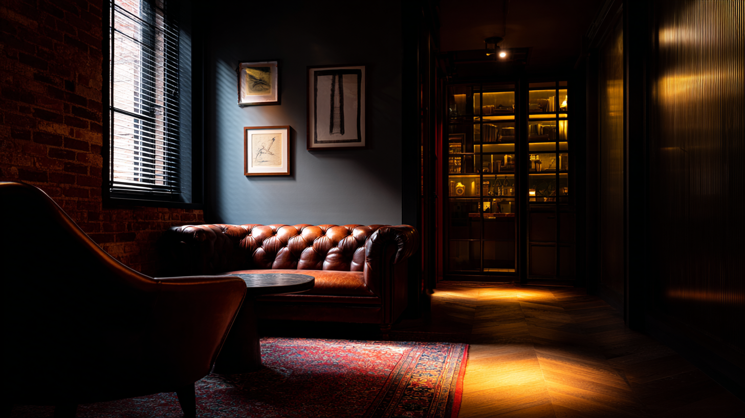
One of the biggest myths in interior design is that dark rooms automatically feel heavy.
They don't.
Some of the most welcoming, sophisticated homes you'll ever walk into are painted in charcoal, deep green, navy, or black.
At the same time, you've probably been inside bright white rooms that somehow felt dull, oppressive, and uncomfortable.
Which raises an interesting question.
If darkness isn't what makes a room feel heavy...
What does?
The answer changes the way you approach masculine interiors.
Darkness Is a Color. Heaviness Is an Experience.
Paint color is only one part of how a room feels.
Heaviness comes from the relationship between light, materials, proportion, and visual movement.
A room becomes heavy when everything behaves the same way.
Every surface absorbs light.
Every material carries similar weight.
Every piece of furniture feels equally substantial.
Nothing creates relief.
Nothing creates rhythm.
The room stops inviting your eyes to explore.
Instead, it asks them to stay still.
Designer Eyes
The goal isn't to make every surface dark.
The goal is to make every surface behave differently.
That's what creates depth.
Contrast Is What Makes Dark Rooms Feel Alive
Dark walls become beautiful because something surrounds them.
Warm wood.
Natural linen.
A bronze lamp.
A stone fireplace.
Soft light falling across textured plaster.
Without contrast, darkness becomes monotone.
With contrast, it becomes atmospheric.
Masculine interiors rely on these relationships constantly.
Leather feels richer beside wool.
Walnut becomes warmer beside charcoal walls.
Matte paint feels deeper when interrupted by subtle metallic finishes.
Darkness becomes interesting because it isn't alone.
Lighting Determines Whether Darkness Feels Elegant or Oppressive
Dark rooms demand better lighting.
Not brighter lighting.
Better lighting.
A single overhead fixture floods the room evenly.
Everything becomes equally visible.
Everything becomes equally flat.
Instead, layer the room.
Table lamps.
Wall sconces.
Picture lights.
Floor lamps.
Accent lighting.
Allow light to travel across surfaces instead of simply filling the room.
Shadows aren't the enemy.
They're one of the primary reasons dark interiors feel luxurious.
Designer Eyes
If every corner of your room is equally bright, your lighting is probably working against the atmosphere you're trying to create.
Ceilings Quietly Control the Room
People spend hours choosing wall colors.
Almost nobody considers the ceiling.
Yet ceilings often determine whether a dark room feels comfortable or oppressive.
A ceiling that reflects just enough light creates lift.
It gives the room air.
Darkening the ceiling can be beautiful when it's intentional and supported by the architecture.
But doing it automatically often causes the room to feel compressed.
Always ask what role the ceiling should play before deciding its color.
Negative Space Becomes More Important
Dark interiors reward restraint.
When every shelf is full...
Every wall is covered...
Every surface is decorated...
The room becomes visually dense.
Dark rooms need breathing room.
Empty wall space.
Clear tabletops.
Open floor area.
Moments where the eye can rest before moving again.
Negative space doesn't weaken a masculine room.
It strengthens the elements you've chosen to emphasize.
Weight Comes From More Than Color
Visual weight is influenced by many things besides paint.
Large furniture.
Heavy textures.
Massive artwork.
Dense materials.
Deep shadows.
Scale.
When several of these are layered together without relief, the room begins feeling slow and immovable.
Balance them with lighter materials.
Natural wood.
Linen.
Glass.
Open shelving.
Directional lighting.
The room remains grounded without becoming overwhelming.
The Goal Isn't Drama. It's Comfort.
The best dark interiors never feel intimidating.
They feel calming.
Protective.
Quiet.
The room wraps around you rather than closing in on you.
That's the difference between dark and heavy.
Darkness creates atmosphere.
Heaviness creates fatigue.
Once you understand the distinction, you'll stop worrying about whether a room is "too dark."
Instead, you'll start asking the better question.
Does this room still breathe?
If the answer is yes, darkness becomes one of the most powerful tools in masculine interior design.
Continue Building Your Eye for Design
Dark interiors succeed because of far more than paint color. They're built through the careful relationship between lighting, materials, proportion, texture, architecture, and visual hierarchy that allows deeper palettes to feel rich instead of overwhelming.
The Masculine Interior Style Guide teaches the ten timeless masculine interior styles we believe every man should understand, complete with exact paint colors, material palettes, furniture direction, styling guidance, and the principles that define each style. It also includes a 30-minute video walkthrough to help you confidently choose the style that best fits your home and bring it to life.
Whether you're exploring darker interiors or designing an entire home, the guide will help you make thoughtful design decisions with confidence and create spaces that feel cohesive, timeless, and unmistakably yours.
Explore The Masculine Interior Style Guide →

Facebook
Instagram
Youtube