Best Masculine Living Room Colors
The safest masculine living room is remarkably easy to create.
Paint the walls charcoal. Add a brown leather sofa. Bring in black metal. Perhaps navy if you are feeling adventurous.
Nothing is necessarily wrong with that palette. The problem is that the search for masculine living room colors has become so narrow that many rooms end up looking more alike than masculine interiors ever needed to.
There is a much wider range available.
Olive. Tobacco. Oxblood. Muted blue. Warm brown. Blackened green. Mushroom. Stone. Cream. Clay.
Even warm ivory can become the dominant wall color in a distinctly masculine room when the furniture and materials provide enough weight.
The question is not which colors are masculine. It is what kind of masculinity you want the room to communicate. If you want an outside opinion on what your own living room is communicating right now, a Room Audit is a fast way to get one.
Masculine Paint Colors Are About Relationships
A paint chip never exists alone once it reaches a room. It sits beside flooring. Wood. Leather. Upholstery. Rugs. Art. Metal. Natural light. Artificial light.
That is why the same olive wall can look warm and traditional beside walnut and brass, then become more modern beside black steel and pale oak.
In our design work, this is often where homeowners become frustrated. They find a color they loved in another room, paint it in their own home, and wonder why it suddenly looks muddy, cold, or much brighter than expected.
The problem is rarely that the color changed. The context did.
This is also why our Stop Guessing Paint Colors Paint Playbook is more useful than collecting another list of best masculine colors. The important skill is learning to evaluate the color in the room where it will actually live.
Olive: One of the Most Flexible Masculine Living Room Colors
Olive is one of the strongest alternatives to gray because it can behave almost like a neutral while still providing obvious color.
It works particularly well with walnut, dark oak, cognac leather, cream wool, brass, bronze, black, and faded red rugs.
A muted olive creates warmth without becoming yellow. A deeper olive can make a room enveloping without producing the visual severity of charcoal. It also bridges traditional and contemporary furniture unusually well.
A clean-lined cream sofa in an olive room can feel modern. Put the same wall color behind a leather club chair, Persian rug, and walnut bookcase and the room moves traditional.
The color is not dictating the style. It is supporting it.
Forest Green Creates More Drama
Forest green is stronger than olive. It usually has more contrast against lighter upholstery and can feel richer in rooms with architectural detail.
Use it when the walls are intended to become part of the room's identity. Paneling. Built-ins. A fireplace wall. A library-adjacent living room. A formal lounge.
Forest green becomes particularly convincing when its surrounding materials are warm. Walnut. Mahogany. Aged brass. Rust. Oxblood. Cream.
Without those counterpoints, dark green paired with black and gray can become colder than expected.
Blackened Green Is a Better Alternative to Black
Some rooms benefit from nearly black walls. But true black can remove much of the color variation that makes a room interesting.
Blackened green solves this. From across the room, it may appear almost charcoal. As daylight moves across the walls, green becomes visible. Under warm lamps at night, the color can become dramatically deeper.
This gives the room more life than a flat black while preserving similar visual weight.
Designer Eyes: Look Into the Corners
When evaluating dark paint, do not judge only the brightest wall. Look into the corners. Look behind the sofa. Look beside the bookcase. That is where the color will be deepest. If those areas collapse into black while everything else in the room is also dark, you may need a lighter wall value or stronger material contrast.
Tobacco Creates Warmth Without Looking Beige
Tobacco lives somewhere between brown, tan, ochre, and earth. That ambiguity makes it useful.
It can feel historical beside antiques. Rugged beside leather. Contemporary beside pale stone. Warm beside black metal.
Tobacco walls are particularly good in rooms that receive enough light to reveal their complexity. Pair them with cream, walnut, oxblood, muted blue, olive, bronze, and black.
The room becomes warmer without drifting toward conventional beige.
Warm Brown Can Be Extremely Sophisticated
Brown walls sound heavier than they often look. Chocolate. Mushroom-brown. Cocoa. Taupe-brown. Deep coffee.
Used well, brown can make art, cream upholstery, brass, and lighter wood appear unusually rich.
The mistake is matching every other surface too closely. Brown wall. Brown leather. Brown rug. Brown table. Brown curtains. Now the room has no visual separation.
Instead, vary values and materials. Dark brown walls. Cream wool sofa. Medium walnut table. Rust-and-blue rug. Bronze lighting. The palette remains earthy but gains hierarchy.
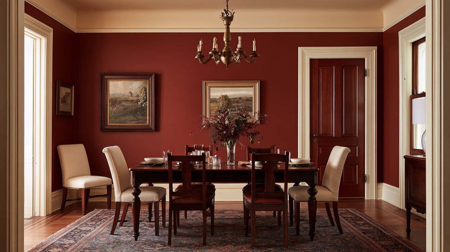
Oxblood Is More Useful Than Most Men Expect
Oxblood sits between burgundy, brown, and deep red. It is one of the richest masculine paint colors because it contains warmth without becoming bright.
It works beautifully in studies, small lounges, dining-adjacent living spaces, fireplace walls, built-ins, and rooms used heavily at night.
Oxblood beside walnut and brass feels traditional. Beside charcoal and modern furniture, it becomes much more contemporary.
The color carries enough identity that you usually need less of it. Perhaps one wall is sufficient. Perhaps the cabinetry takes the color while surrounding walls remain warm ivory.
Muted Blue Is More Interesting Than Automatic Navy
Navy is popular for good reason. It is familiar, stable, and easy to coordinate. But blue does not need to be that dark.
Slate blue. Dusty blue. Gray-blue. Muted indigo. Smoky blue. These tones can create a masculine room that feels lighter and more residential.
Muted blue works particularly well with medium oak, cognac leather, rust, cream, brown, and aged brass. It is especially useful when the room already contains dark furniture and needs color without additional visual weight.
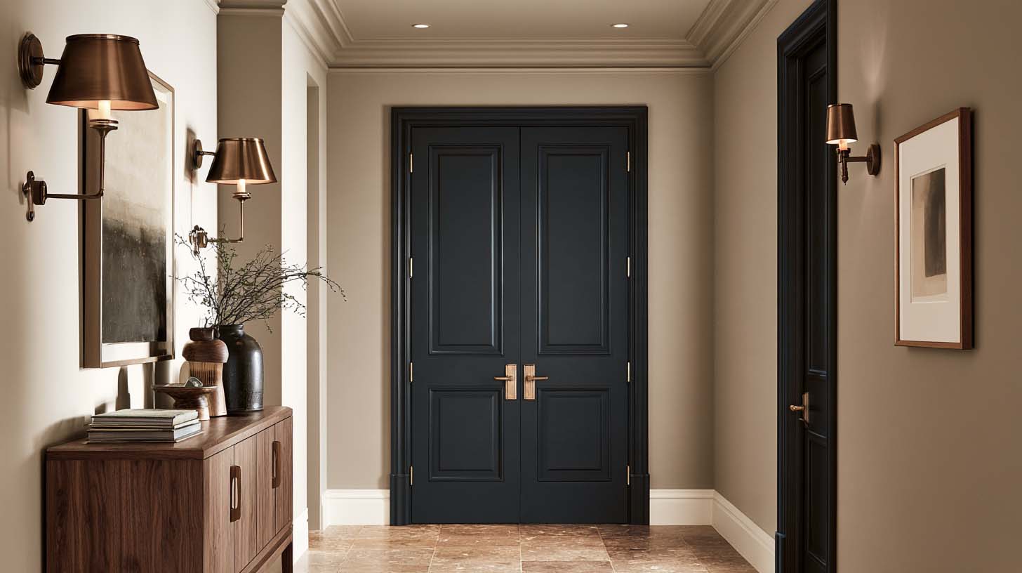
Mushroom Is the Neutral Men Overlook
Mushroom sits between taupe, gray, beige, and brown. It can be difficult to describe precisely, which is part of why it works.
A good mushroom paint gives the walls more depth than basic beige without making the room obviously colorful. This is particularly useful in transitional or modern masculine interiors.
Pair it with espresso wood, charcoal, oxblood, deep green, bronze, cream, and rust. The room can remain quiet without becoming sterile.
Stone and Warm Gray Still Have a Place
Gray is not the enemy. Flat, cool builder gray everywhere is the problem.
Stone colors with brown, green, or warm mineral undertones can work beautifully in masculine living rooms. They become useful when furniture and art are already doing significant color work.
A faded Persian rug. Cognac sofa. Olive chairs. Dark wood. Strong artwork. In this room, a quieter wall can be exactly right. The wall does not always need to become another focal point.
Cream Can Be Masculine
This is perhaps the most important correction. A masculine living room can absolutely have cream walls. Or warm ivory. Or off-white.
If the room contains substantial walnut furniture, dark art, bronze fixtures, wool, leather, aged rugs, and strong silhouettes, the walls can become relief.
Light rooms sometimes feel more masculine precisely because the furniture gains greater visual authority against the pale background.
Masculinity should come from the composition, not an obligation to darken every available surface.
Light Direction Changes the Color
Natural light is one of the biggest reasons paint looks different from one home to another.
North-facing rooms generally receive cooler, softer light, while south-facing rooms tend to receive warmer and more consistent illumination. East- and west-facing rooms shift more noticeably throughout the day as direct sunlight changes direction.
This matters enormously with masculine colors. A cool gray-blue may become especially cold in a north-facing room. Tobacco may become intensely warm in strong late western light. Olive can look gray in one exposure and distinctly green in another. Blackened green may look nearly black in a dim room but reveal considerable color in a brighter one.
Never choose the final wall color from a small chip under showroom lighting.
Test Paint in More Than One Location
This is one of the most practical pieces of advice we can offer.
Place large samples on more than one wall. Then look at them morning, midday, late afternoon, and night. With lamps on. With curtains open. Beside the actual sofa. Beside the flooring. Beside the rug.
A color should survive several conditions, not just look good for fifteen minutes at noon.
Designer Eyes: Hold the Wood Against the Paint
If the room contains a lot of wood, put the actual wood sample against the paint. This immediately reveals undertone conflicts. A strongly orange wood can make one olive look beautiful and another suddenly yellow. A red mahogany may alter the way a mushroom neutral reads. Paint cannot be selected independently from the largest permanent materials in the room.
Consider the Floor Before the Wall
Flooring is often ignored because it already exists. That does not make it neutral.
Warm oak. Gray LVT. Dark walnut. Orange-toned hardwood. Cream stone. Cool concrete. Each changes what happens above it.
If the floor is already warm, you may not need an equally warm wall. If the floor is cool gray, introducing tobacco or warm mushroom may correct the room. If the floor is very dark, slightly lighter walls may preserve material separation.
The floor is part of the palette whether you chose it or inherited it.
Leather Changes Paint More Than You Think
Cognac leather carries orange. Chocolate leather carries deep brown. Black leather adds hard contrast. Oxblood leather introduces red.
Paint that appears perfect before furniture arrives can shift once a large leather sofa occupies six or seven feet of wall.
This is why a leather-heavy room often benefits from a wall color that provides contrast rather than another brown. Olive. Muted blue. Warm ivory. Mushroom. Blackened green. All can give leather a clearer role.
Do Not Choose the Wall Before the Rug If the Rug Matters
A strong rug may contain ten colors. That makes it an excellent palette source. Muted red. Blue. Cream. Brown. Olive. Black.
Instead of forcing a favorite paint color onto the rug later, sometimes the better sequence is to let the rug tell you which wall colors are already present.
A small secondary color in the rug can become a powerful wall color. This is how rooms begin feeling connected without obvious matching.
Color-Drenching Can Make Architecture Stronger
Painting walls, trim, built-ins, and sometimes ceiling in related or identical color can create a remarkably complete room.
It works particularly well when the room is small, architecture is fragmented, built-ins should visually integrate, you want enclosure, or a study-like atmosphere is desirable.
But color-drenching removes contrast between architectural edges. That increases the importance of furniture, lighting, artwork, and textiles. If everything is deep olive, for example, cream upholstery and warm metal may become essential.
The TMH Perspective
The best paint color for a masculine living room is rarely found by asking what color looks most masculine. That is too narrow a question.
Ask instead: What does the flooring need? What color makes the wood look better? Does the leather need contrast? What happens to the rug? How much light enters the room? Do we want the walls to recede or participate? Is this room warm enough already?
Those questions usually lead beyond charcoal and navy. And that is where the room begins becoming more individual.
If you keep collecting paint samples but cannot tell why some look right in photographs and wrong in your room, TMH's Full-Service Interior Design can choose color together with the undertones, surrounding materials, and lighting that actually determine whether it works.
Frequently Asked Questions
What are the best masculine living room colors?
Olive, forest green, blackened green, tobacco, oxblood, muted blue, warm brown, mushroom, stone, cream, and charcoal can all work. The right choice depends on light, flooring, wood, furniture, and desired atmosphere.
Does a masculine living room need dark walls?
No. Warm ivory, mushroom, stone, cream, and muted lighter colors can feel distinctly masculine when paired with substantial furniture, wood, leather, rugs, art, and metal.
What color works well with a brown leather sofa?
Olive, muted blue, warm ivory, mushroom, deep green, charcoal, and certain warm stone colors all pair effectively with brown leather.
Is navy still a good masculine paint color?
Yes. Navy remains useful, but it should be chosen because it suits the room rather than because it is the default masculine option.

Facebook
Instagram
Youtube