How to Choose a Masculine Color Palette for Your Home
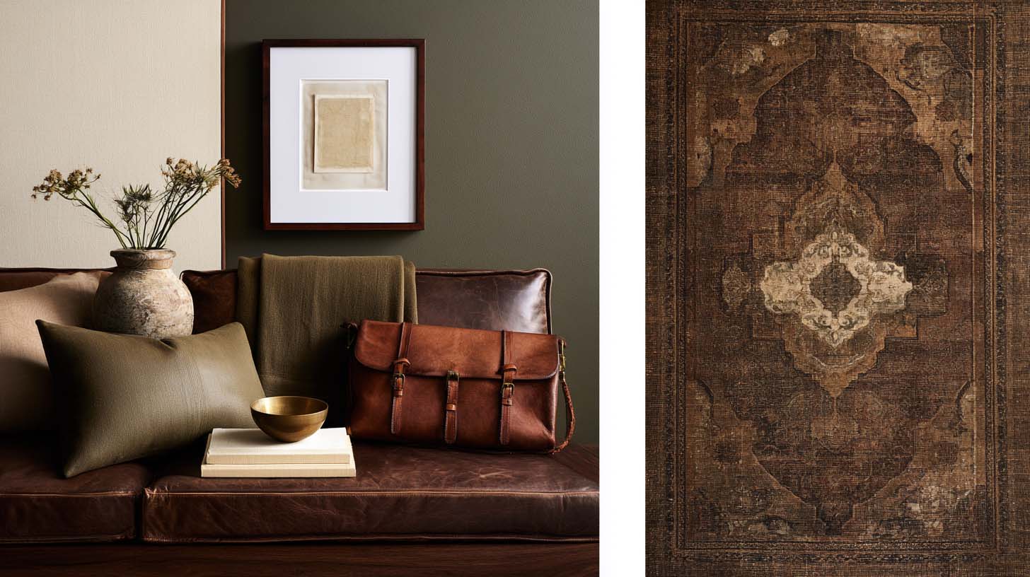
A masculine color palette does not begin with a list of dark paint colors. It begins with atmosphere. Do you want the room to feel grounded and traditional? Warm and relaxed? Clean and contemporary? Collected and scholarly? Rugged? Refined? The same man could live comfortably in an olive study, a cream-and-walnut living room, an oxblood dining room, or a pale stone bedroom. All of these can feel masculine. What matters is how color interacts with material, light, visual weight, and contrast.
This is why simply searching "masculine paint colors" tends to produce disappointing results. A color that looks extraordinary beside walnut and aged brass can feel completely different beside cool gray flooring and chrome. Color is relational. The room decides what the paint becomes.
Stop Equating Masculine With Dark
Dark colors are useful because they introduce visual weight. Charcoal, blackened green, deep navy, tobacco, espresso, and oxblood can create remarkable rooms. But darkness alone is not masculinity. A pale limestone room furnished with walnut, cognac leather, cream wool, and bronze can feel deeply masculine because the materials carry substance. A black room filled with delicate furniture can feel surprisingly weak by comparison.
Think of darkness as one tool among many. It can make a large room more intimate, draw attention to architecture, create drama, or provide a background for artwork and warm materials. It should not be used merely as proof that a man lives there.
Begin With the Fixed Materials
Before choosing a wall color, identify what you cannot, or do not intend to, change: flooring, stone, cabinetry, large wood furniture, brick, tile, leather upholstery. These already contain color. A walnut floor may carry brown, red, chocolate, or purple undertones. White oak can appear beige, honeyed, gray, or almost blonde depending on finish. Cognac leather introduces orange and red. Soapstone may lean blue-gray or green-gray. Cream limestone brings yellow and beige. Your paint needs to participate in that existing conversation.
Designer Eyes: Find the Quietest Color Already in the Room
Look closely at your rug, stone, artwork, or upholstery. Often the best wall color is not the dominant color in the room. It is a quieter secondary tone already present somewhere in the material. Pulling that color outward creates cohesion without making the room look matched.
Understand Warm and Cool Masculinity
Warm masculine interiors often rely on tobacco, camel, cream, warm brown, oxblood, rust, olive, warm stone, muted terracotta, warm walnut, and aged brass. These rooms tend to feel intimate, collected, and hospitable.
Cooler masculine palettes might use blue-gray, slate, deep navy, charcoal, cool taupe, blue-black, cool oak, and blackened steel. These can feel architectural, restrained, and contemporary.
Color temperature is not always obvious from the color name. Two greens may behave differently because one leans yellow while another leans blue. Sherwin-Williams describes warm and cool undertones as a key distinction within color families and notes that neighboring light conditions materially affect how they appear. (Sherwin-Williams) The practical lesson is simple: never select a masculine paint color from the name alone.
Masculine Neutrals Go Far Beyond Gray
For years, gray became the universal answer to "masculine." The result was thousands of rooms filled with cool gray paint, gray sofas, gray rugs, and black furniture. Gray is not the problem. Lack of complexity is. Consider these alternatives instead.
Mushroom
A brown-gray neutral with enough warmth to work beautifully beside walnut, antique brass, cream, leather, and old rugs.
Stone
Stone colors can range from creamy beige to gray-brown. They feel architectural without becoming stark.
Putty
A warm, muted neutral that works particularly well in traditional and collected interiors.
Camel
Camel provides warmth and depth without requiring dark walls.
Warm Cream
Cream can be highly masculine when paired with strong architecture, dark wood, leather, and substantial furniture.
Taupe
A good taupe bridges warm and cool materials effectively. The objective is never choosing the neutral associated with masculinity. It is choosing the neutral that strengthens everything around it.
Tobacco Brown
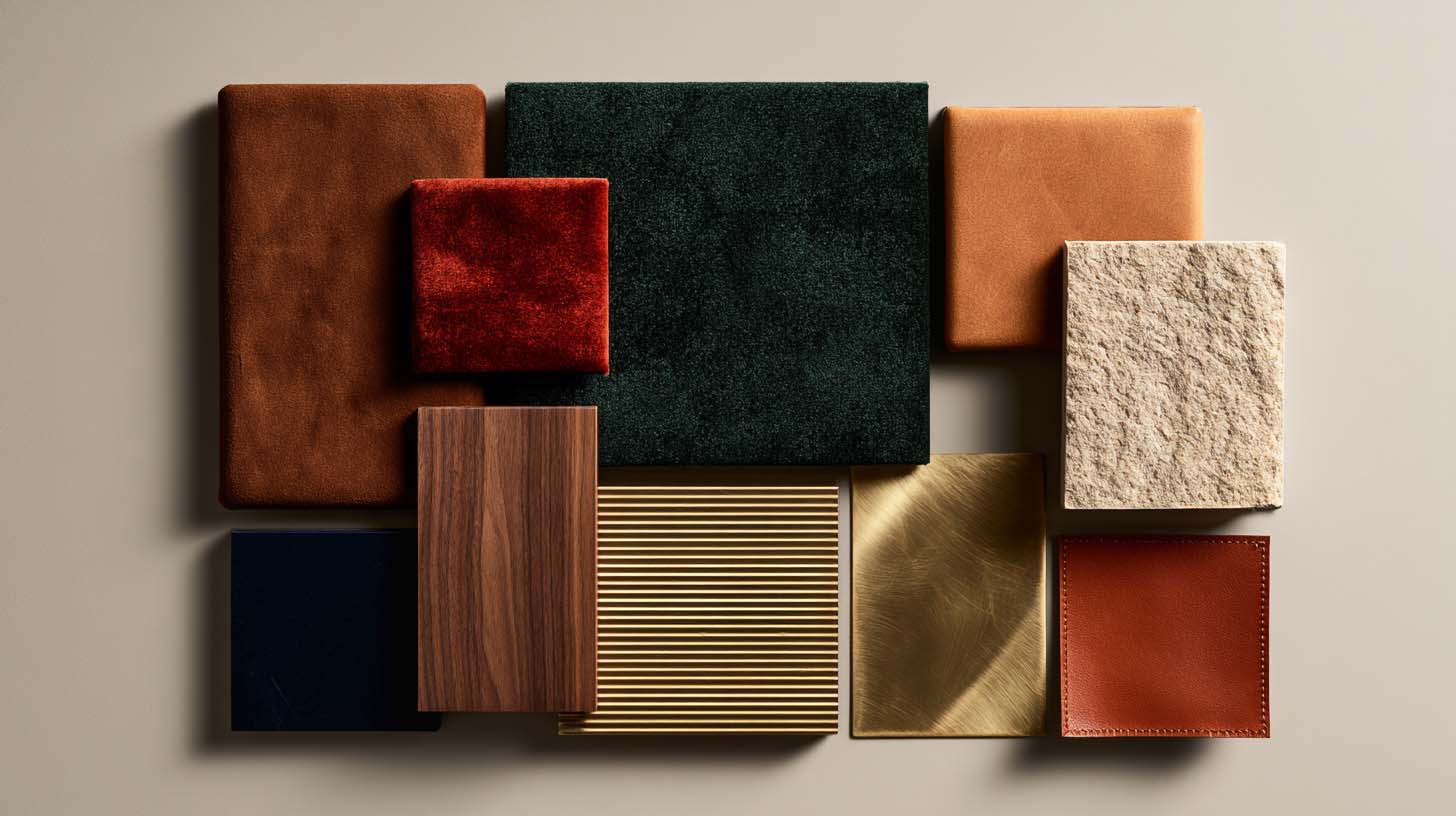
Tobacco deserves special attention because it sits in a useful space between neutral and color. It works with dark walnut, oak, cognac leather, olive, cream, burgundy, navy, aged brass, and black. On walls, it can make a room feel deeply enveloping. In leather or textiles, it becomes easier to use across larger spaces. Tobacco also ages visually well because it already belongs to the family of colors associated with wood, leather, old books, and patinated materials.
Olive and Forest Green
Green is one of the most versatile masculine interior colors. Olive tends to feel warmer and more relaxed. Forest green reads richer and more formal. Blackened greens introduce drama without the bluntness of pure black. Green works particularly well beside walnut, mahogany, medium oak, cognac leather, brass, bronze, cream, faded reds, and traditional rugs. Its connection to landscape also lets it move across English Country, Traditional, Western, Modern Heritage, and contemporary rooms.
Oxblood and Burgundy
Deep reds are frequently overlooked because they seem difficult. Used badly, they feel heavy or theatrical. Used carefully, they produce exceptional masculine interiors. Oxblood works particularly well in dining rooms, libraries, studies, powder rooms, upholstery, rugs, and accent furniture. Pair it with warm wood and restrained neutrals rather than trying to repeat the red everywhere. One deep burgundy chair in an otherwise brown, cream, and walnut room can be enough color for the whole space.
Navy and Muted Blue
Navy remains popular for good reason. It is easy to live with, works with brown, leather, brass, oak, walnut, cream, and gray, and can move from traditional to contemporary. The mistake is treating navy as the only acceptable blue. Muted slate blue, dusty indigo, blue-gray, and desaturated denim tones can produce more nuanced rooms. A muted blue wall beside a warm walnut desk and a cognac chair often feels far more distinctive than another navy office.
Black Is Better as a Tool Than a Default
Black gives definition: frames, lamp bases, metal windows, cabinet hardware, furniture, doors, trim. A single black object can sharpen a composition. Too much black flattens it, especially when every new purchase defaults to matte black because it feels safe. Black sofa, black coffee table, black shelf, black lamp, black frame, and the room quickly loses material distinction. Let black outline and punctuate rather than automatically dominate.
Brown Is a Color
Modern decorating culture has sometimes treated brown as an unfortunate by-product of wood and leather rather than a deliberate color choice. That misses one of the strongest tools available in masculine interiors. Brown can be espresso, tobacco, chestnut, saddle, chocolate, camel, umber, walnut, or mahogany. Layering several browns creates enormous depth. The key is avoiding a room where every brown reads nearly identical. A dark walnut cabinet, a cognac leather chair, a camel wool rug, and a cream wall produce tonal variety without pulling in a lot of unrelated color.
Use Saturation Carefully
Masculine rooms often respond well to muted color, not because bright color is unmasculine, but because desaturation lets materials and architecture participate more strongly. Compare vivid emerald with blackened forest green, bright orange with tobacco, primary red with oxblood, royal blue with slate. The muted versions tend to integrate more naturally with wood, leather, stone, metal, and aged textiles, and they become easier to layer. That said, a controlled saturated color can be extraordinary when the architecture calls for it. Restraint does not mean fear.
Light Changes Everything
Paint color does not exist independently of light. Natural orientation, window size, surrounding landscape, artificial lighting, and time of day all affect how a color reads. North-facing light tends to make rooms feel cooler, and undertone and light reflectance both shift how paint appears across changing daylight and artificial light. The perfect olive you saw online may look gray in your room. A sophisticated brown may suddenly read purple. A cream may turn yellow.
Designer Eyes: Sample Vertically
Do not judge wall paint from a small card held horizontally under store lighting. Paint a substantial sample, or use a large movable sample, and look at it vertically on the actual wall. Check it in morning light, midday, late afternoon, and evening lamps. You are not selecting one color. You are selecting the series of colors that paint becomes throughout the day.
Build a Palette, Not a Paint Scheme
A home's color palette includes much more than wall paint. Think in layers: the architectural base of walls, ceilings, trim, flooring, and stone; large furniture like the sofa, bed, cabinetry, and dining table; secondary furniture such as chairs, nightstands, consoles, and desks; textiles including rugs, curtains, bedding, upholstery, and pillows; metals like brass, bronze, nickel, iron, and blackened steel; and finally art and objects, the smaller colors that keep a room from feeling over-coordinated. A successful masculine color palette lets all six layers interact.
Try the 60-30-10 Rule, Then Stop Taking It Literally
The traditional 60-30-10 guideline can help beginners think about dominant, secondary, and accent color, but real rooms are rarely that mathematical. A better TMH interpretation: establish a dominant atmosphere, support it with a secondary material family, and use contrast selectively. Warm cream architecture, walnut and brown furniture, and olive, burgundy, brass, and black appearing in smaller amounts is enough. You do not need to calculate upholstery percentages.
Three Masculine Palette Examples
Warm Traditional
Warm cream walls, walnut furniture, cognac and chocolate leather, olive wool, burgundy accents, aged brass. This feels established and hospitable.
Contemporary Architectural
Mushroom walls, smoked oak, cream wool, blackened metal, travertine, muted olive. This feels quieter and more modern.
Dark Collected
Blackened green walls, mahogany or dark walnut, faded Persian reds, tobacco leather, warm linen, antique brass. This creates considerable atmosphere without requiring every object in the room to be dark.
Let Color Connect the Home
Individual rooms do not need to match. They should feel related. One of the easiest ways to create continuity is repeating certain colors or materials in changing proportions: olive appears prominently in the study but only as a small textile in the living room, walnut runs through multiple rooms, warm cream becomes a recurring architectural neutral, aged brass repeats in the lighting. This makes the house feel intentional without making every space identical. Not sure which palette actually ties your rooms together? The free 10 Masculine Color Palettes guide is built to answer exactly that.
The Best Masculine Color Palette Is the One the Materials Support
If there is one principle worth remembering, it is this: choose color after you understand what it has to live beside. A masculine palette is not a prescribed group of dark colors. It is a disciplined relationship between architecture, natural light, wood, leather, stone, textiles, metals, and paint. Get those relationships right and even pale colors feel substantial. Get them wrong and black paint will not save the room.
Ready to pick your color? Get the $17 Paint Playbook
Frequently Asked Questions
Do masculine rooms have to be dark?
No. Darkness is one tool for adding visual weight, but pale, material-rich rooms in limestone, walnut, and cognac leather can feel just as masculine as a charcoal study.
What is the best masculine neutral besides gray?
Mushroom, stone, putty, camel, warm cream, and taupe all outperform plain gray because they carry more warmth and complexity alongside wood and leather.
How many colors should a masculine room have?
There is no fixed number, but most successful rooms build from one dominant atmosphere, one supporting material family, and a smaller amount of contrast color layered on top, rather than an even split of many competing tones.
Does lighting really change paint color that much?
Yes. Sherwin-Williams notes that the same swatch can read cooler in north-facing light and warmer under evening lamps. (Sherwin-Williams) Always sample paint vertically on the actual wall and check it across the full day before committing.

Facebook
Instagram
Youtube